Organise Your IPad With 3 Home Screens
I love the simplicty of the apps display on my iPad. It’s unfussy and simple enough for a child to use, but straightforward and unfussy can also mean incredibly cluttered when you have a lot of apps. So how can you keep it unfussy but also efficiently organised?
I tried searching for efficient methods for organising the apps, but all I found were articles telling me physically how to customise it using the inbuilt tools or offering really vague advice, like review them regularly to keep the numbers down. So I came up with my own system that seems to work well, and in a communal spirit I’ve decided to share.
I won’t be covering how to physically customise your screens. If you don’t know how to move/delete apps or create folders, then this is a good article to help you: How to Organize Apps on Your iPad
The iPad can have up to 11 screens of apps (20 per page), but if you’re trying to manage individual apps strewn across that many screens it’ll drive you mad. You can put some into folders, but how do you corral it all in a way that makes logical sense?
This model is based on using just 3 screens. The key that underpins this is Be Brutal. If you’re not using an app on a regular basis and can’t justify exact realistic circumstances for when you will use it: lose it.
First up, the Dock – the shelf like thing which stays at the bottom of all screens – holds my main functional apps: Email, Browser, Photos, Camera, Printer. You can have up to 6 apps on the Dock but I only need 5, so I only put 5 on there. This is an another important concept in my model. You don’t need to fill the space available. Only use what you need to.

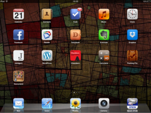
The main home screen is where I put the apps I know I use every day, or several times a week. Think of it like a hub or desktop for your main activities. These are all the apps you want one click access to. Be realistic about what you really use. You might want to swap apps around for a bit whilst you work out which ones you do use most often. Make it comfy for yourself, and keep it to this one screen. If you can go through a whole typical day without ever having to leave this one screen of apps, then you know you’ve got it set up exactly right.
As I said, each screen can hold 20 apps. Remember the rule: just because you can, doesn’t mean you have to. If you only need 7 apps on a daily/weekly basis, then only put those 7 apps on this screen.
You can also put web bookmarks on here by saving them from Safari, but that rule again: only if you need them.
How to: Add Favorite Websites & Bookmarks to the iOS Home Screen

This is screen 2. This holds everything else. It’s got two elements to it.
First up, top left I have what I refer to as the device utility apps: App Store, iTunes and Settings. I don’t use these on a daily basis, so they don’t meet the criteria for being on the main home screen. However when I do want them, I want quick access to them. Here they are: 1 swipe and 1 click away.
Secondly, category folders. All the other apps have been divided up by category. These catagories are whatever most makes sense to you. No one else need even understand them, so call them exactly what you need to so you can find the apps you want quickly.
With all the apps arranged like this, then all the apps on your iPad that aren’t one click apps or device utilities (1 swipe/1click) will be 1 swipe and 2 clicks to access. All of them.
You can have up to 2o apps in each folder but once again, just because you can…  17 folders x 20 apps = 340 apps in total on this one page. If you have less than that, this model works easily. If you have more than that, do you really need that many? If your yes is an honest one, only then go to having another screen of apps.
So if all the apps in my model fit onto just 2 screens, why have I suggested 3 screens?

Screen 3 is optional but I find it useful. This screen is for web bookmarks that you use regularly but can’t justify putting on the main home screen. (see link above for how to bookmark to the screen)
If you put a bookmark straight onto this page, then access to that website will be 2 swipes and 1 click away from home.
You can put these bookmarks into category folders the same as you can with apps. If you do that they become 2 swipes and 2 clicks to access, which I definitely think beats typing the url or fiddling with bookmark menus in the browsers for the stuff you access often.
As always, less is more. <brokenrecord> Don’t fill the screen just because you can. </brokenrecord> Think about what you really need on here.
That’s it. Please let me know if you find this useful.